02
02
Trieste Film Festival
Trieste Film Festival

Type
Type
Visual Identity
Visual Identity
Year
Year
2024
2024
About
About
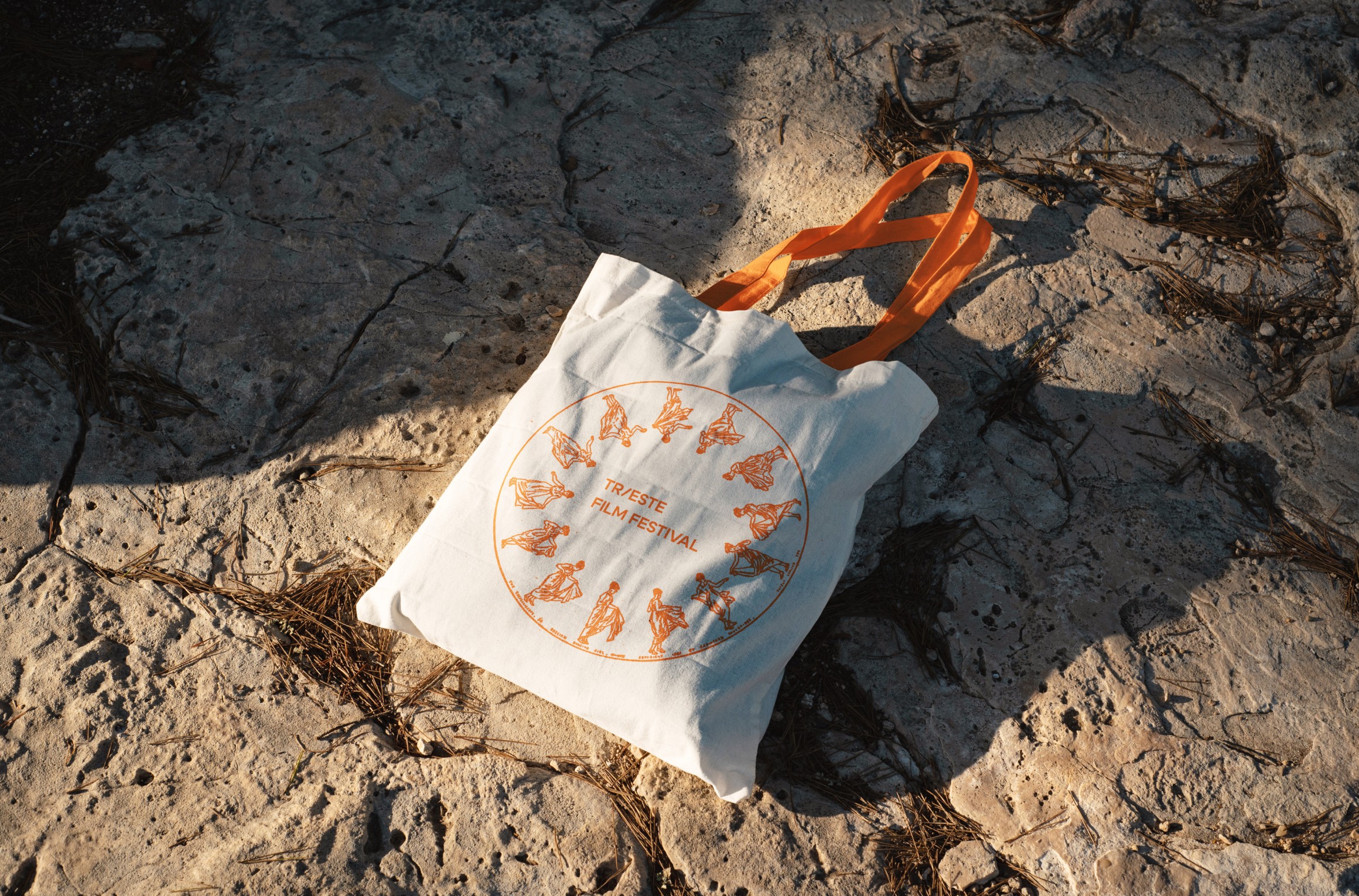
The Trieste Film Festival was the first I ever attended, and it stuck with me. It’s held in a city that is known for its shifting borders and overlapping cultures. The festival reflects its setting: open, in-between, always reaching out. The mission of the organization and festival is to spotlight independent voices, especially from Central and Eastern Europe, and to connect independent filmmakers with audiences across the world. I used to live just 30 minutes away, so I’ve gotten to know Trieste well. The mix of Italian, Slavic, and Austro-Hungarian influence shows up not just in the buildings, but in the feel of the place. That mix, contrast, and connection inspired the visual identity I designed. The logo blends a “T” letter with a plus sign: simple shapes that suggest location, crossing paths, and inclusion. The orange and purple color palette reflects this duality: orange drawn from the warm terracotta rooftops typical of Italian architecture, and purple as a contrast, symbolizing creativity, transformation, and the boldness of new perspectives. Together, the two colors create a palette that’s vibrant, open, and a bit unconventional My goal was to build a system that felt grounded in Trieste’s past, but looking forward. Something that welcomes, connects, and amplifies new voices, just like the city and the festival have done for decades.
The Trieste Film Festival was the first I ever attended, and it stuck with me. It’s held in a city that is known for its shifting borders and overlapping cultures. The festival reflects its setting: open, in-between, always reaching out. The mission of the organization and festival is to spotlight independent voices, especially from Central and Eastern Europe, and to connect independent filmmakers with audiences across the world. I used to live just 30 minutes away, so I’ve gotten to know Trieste well. The mix of Italian, Slavic, and Austro-Hungarian influence shows up not just in the buildings, but in the feel of the place. That mix, contrast, and connection inspired the visual identity I designed. The logo blends a “T” letter with a plus sign: simple shapes that suggest location, crossing paths, and inclusion. The orange and purple color palette reflects this duality: orange drawn from the warm terracotta rooftops typical of Italian architecture, and purple as a contrast, symbolizing creativity, transformation, and the boldness of new perspectives. Together, the two colors create a palette that’s vibrant, open, and a bit unconventional My goal was to build a system that felt grounded in Trieste’s past, but looking forward. Something that welcomes, connects, and amplifies new voices, just like the city and the festival have done for decades.